Nearpod version available
When Graphs Mislead Us – Analyzing GDP
Objective
Students will be able to:
- Explain the relationship between a country’s real gross domestic product per capita and its standard of living.
- Manipulate the units, scales, and origin in a graph to support a given statement.
- Analyze a graph to determine whether or not it is misleading.
Concepts

In this personal finance lesson, students will understand how graphs can be misleading through real GDP.
Resources
- Activities 1 through 4 – one copy per student
- Activity 1 – Vital Signs of a Country
- Activity 2 – Same Data?
- Activity 3 – What’s Misleading?
- Activity 4 – Headline News
- Activities Answer Keys 1 through 4 – one copy per student
- Activity 1 Answer Key – Vital Signs of a Country
- Activity 2 Answer Key – Same Data?
- Activity 3 Answer Key – What’s Misleading?
- Activity 4 Answer Key – Headlines
- Gross domestic product video available at https://www.econedlink.org/resources/gross-domestic-product-gdp-video-and-quiz/
- When Graphs Mislead Us presentation PowerPoint presentation | PDF presentation
-
Copies or images of recent graphs you have seen in a newspaper or online that use the same data presented in different ways
-
Activity 5, one copy, cut apart
-
Mobile devices, tablets or computers with internet access and, if possible, screen recording capability, one per group
Procedure
Becoming a good consumer of information means being able to determine whether graphs are misleading. To do so, students must learn the components of a graph and how to tell whether they as readers are being manipulated to serve a specific point of view. Just like vital signs determine the health of a person, data about a country can show its health. Specifically, a country’s material standard of living is directly proportional to its real Gross Domestic Product per capita. In other words, if a country has a high real GDP per capita, it also has a high standard of living.
- Ask students how they know whether or not they are healthy. [Answers will vary. Students may provide answers such as an ability to run a long distance or lift a heavy object.]
- Explain that vital signs are a measurable way to determine the health of a person. Tell them that one example of a vital sign is a person’s blood pressure. Ask the students to generate a list of other vital signs based on their experiences going to the doctor. [Answers will vary but may include temperature, height, weight, body mass index or BMI, cholesterol level, etc.]
- Explain that, just like people, the health of a country can be measured by looking at various vital signs. These vital signs are measured using various data.
- Distribute a copy of Activity 1 to each student.
- Tell the students to complete the activity as they watch the video. Show the video on Gross Domestic Product (GDP) found at https://www.econedlink.org/resources/gross-domestic-product-gdp-video-and-quiz/.
- Pause the video at 3:13 when the following question is asked: “Which country do you feel has the higher quality of life? Why?” Have the students consider the question individually and then share their responses. [United States, Japan, and Germany because they have higher per capita GDP, Life Expectancy, and Adult Literacy and lower Infant Mortality.]
- Define standard of living as a measure of the goods and services available to each person in a country; a measure of economic well-being. This is also known as per capita real GDP (gross domestic product).
- Explain that economists use a country’s real GDP per capita to measure standard of living. The higher a country’s real GDP per capita, the better the standard of living, because there are more goods and services available per person. In math terms, the two variables are directly related. Economists use real GDP per capita instead of nominal GDP per capita because real GDP per capita accounts for changes in production of goods and services but not changes in prices of goods and services; that is, real GDP is adjusted for inflation. The real GDP per capita is calculated by dividing real GDP by the country’s population.
- Conclude the video and choose “Take Quiz.” Answer the questions to the quiz together as a class allowing students to reference their responses on Activity 1. The quiz will self-correct if an incorrect answer is given.
- Review the answers to Activity 1 shown on Activity 1 Answer Key. If needed, replay portions of the video referenced on the Answer Key.
- Ask students to recall how each type of GDP data were shown throughout the video. [Graphically.]
- Show Slides 1. Explain that graphs must contain certain components in order to be complete and ensure the data are displayed meaningfully. If components of a graph are missing, it may result in the graph not being fully understood.
- Show Slide 2. Explain to students that a graph must have a title describing what the graph is about and that both axes must be labeled with units where applicable. Define units as any specified amount of a quantity, as of length, volume, force, momentum, or time, by comparison with which any other quantity of the same kind is measured or estimated.
- Show Slide 3. Explain that the scale shows the range of values being shown on the axes (X-axis = horizontal, and Y-axis =vertical). The origin is where the axes intersect. The interval is the difference between each value on the scale. Note that not every graph begins the scale at zero. Unless a graph is considered logarithmic, the intervals should always be even. In the example shown, the interval is two on both axes.
- Open the video again at https://www.econedlink.org/resources/gross-domestic-product-gdp-video-and-quiz/ and fast-forward the video to 2:40. Pause the video at the graph shown. Ask the following to check for understanding:
- What time period in U.S. history does the data cover? [1952-2009]
- What part of the graph shows the time period covered? [The title]
- How can we tell if the scale is evenly spaced on both the X and Y axes? [The Y-axis increases by $3,000 at each increment while the X-axis increases by five years.]
- Point out that the graph shows the level of GDP at a given point in time. Discuss the following:
- What was the real GDP in 1962? [3,000 billion dollars or $3,000,000,000,000]
- Why is the real GDP in 1962 not $3,000? [Because the unit is billions of dollars.]
- Why does the title of the graph include “2005 dollars?” [Real GDP is adjusted for inflation and the basis for this graph is the value of the dollar in 2005. (Note: If desired, discuss the use of large numbers and/or scientific notation.)]
- Distribute Activity 2 to each student. Give students time to review the graphs and answer the questions independently or in pairs.
- Review the answers to Activity 2 using the Answer Key. If dividing the lesson between two class periods, end day one here.
- Tell students that all of the graphs they have seen so far in the lesson have been accurate and unbiased. Explain that not all graphs are constructed that way and that you want them to become informed consumers of information. To do so, they must learn to determine whether or not a graph is displaying data in a way that is accurate and unbiased.
- Show Slide 4. Ask students the following questions:
- What is the total expenditure on one peanut butter candy bar? [$2]
- What is the total expenditure on two candy bars? [$4]
- What would you assume the total expenditure on 8 candy bars would be? [$256]
- Is this a good graph of these data? Explain your answer. [No. It only shows data for up to eight candy bars]
- What would be a better way to accurately display the price of the candy bars? [The graph shows a steady increase in the price. A better graph would use even increments on the Y-axis.]
- Show Slide 5. Tell students that some graphs – such as the one they just looked at – can be misleading.
- Show Slide 6. Explain what is meant by “misleading graphs.” A graph is misleading when it does not display the data correctly. The shape of the graph may lead an observer to make incorrect inferences regarding the trends displayed.
- Show Slides 7 – 8. Tell the students to study the graphs and discuss why each graph may be misleading. Check for understanding by asking the following questions:
- For Slide 7, ask the students if the graph is misleading and to explain the graph. [Yes, the graph is misleading. House prices only decreased by $2000, but the scale on the Y-axis does not start at $0.]
- For Slide 8, ask the students whether the statement is supported by the graph. [Yes, the statement is correct.]
- Point out that the origin on the Y-axis is not zero. Have students redraw the answer. Ask whether the graph is misleading and why. [Yes, the graph is misleading. The tons of waste in 2000 seem much less than the tons of waste in 2006.]
- Graph using increments of 100 on the Y-axis and an origin of zero. Ask students if the new graph is more or less misleading. [The new graph is less misleading.]
- Distribute a copy of Activity 3 to each student. Have the students read the directions and complete the activity.
- Review the answers to Activity 3 using Activity 3 Answer Key.
- Tell students that in many instances when data becomes available, they will see the same data presented in many different forms. Often, those presenting the information have a particular point of view they wish the audience to take with regard to the data. Ask students for one or two examples of this in the news. (If possible, ask for examples of recent graphs they have seen in the news that use the same data presented in different ways.) [When the federal government releases unemployment data, news stories can employ the same data, but vary greatly in tone and content. For example, one news story might focus on the increase or decrease in the data from the previous quarter while another might show changes over the course of a decade. Other examples may include interest rates, school test scores, or tax changes.]
- Distribute a copy of Activity 4 to each student. Divide the class into six groups and give each group a headline from Activity 5. Each group needs access to the internet via computer or mobile device. Tell students their job is to develop the best possible graph they can for the headline they have been given.
- Direct students to write their headline on Activity 4 and work in groups to determine the best year and graph possible to support their headline.
- Allow students time to work in groups to develop the best-fit graph for their headline. Students will also need to determine the year their headline was written and explain their reasoning. If necessary, remind students to review their answers on Activity 1 and 2 for help in understanding the relationship between their data and news headlines.
- When the groups have developed their final graphs, have students present their end product including the screen recording of their process or screen shots captured in the process. Each group should explain why they manipulated the data in the manner they chose and how they chose the year for their headline.
- Debrief the activity by asking students the following questions:
- How many sets of data were used in this activity? [Every group started with the same set of data.]
- How many ways could this information be displayed? [A number of graphs could be created by choosing various scales, increments, origins, and units.]
33. Review the key points of the lesson using the following questions:
-
- How can consumers be swayed to believe a specific point of view by a graph? (Answers may include how graphs can be manipulated using the scale, origin, and units.)
- Tell students the majority of the graphs they used in the lessons were about gross domestic product. Ask students why someone might try to misrepresent data about a country’s real GDP per capita. (A candidate for public office might want to sway voters to believe the standard of living has decreased under the incumbent.)
- Conclude the lesson by having students describe how they will critically analyze graphs in the future to be sure they aren’t fooled by a misleading graph. (Answers may include the following: review the data for an uneven scale, look at the units on both the axes, make sure no information is missing, and be sure the statement matches the information presented.)
Assessment
Multiple Choice
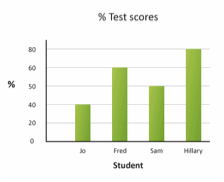
- What is misleading in the graph below?

- Title
- Origin
- Unit
- [Scale]
- Which two of the following would be used to determine a country’s standard of living?
| Country | Infant Mortality Rate (per 1,000 live births) | Population (in millions) | Real GDP (in millions of U.S. Dollars) | Life Expectancy |
| Australia | 4 | 22.3 | 922,870 | 82 |
| Finland | 3 | 5.4 | 390,407 | 80 |
| Germany | 3 | 81.8 | 3,204,596 | 81 |
| Japan | 2 | 126.5 | 4,383,325 | 83 |
- Infant mortality and population
- Life expectancy and real GDP
- [Population and real GDP]
- Real GDP and infant mortality
(NOTE: Data from FRED, 2011)
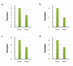
- Which of the following graphs might lead people to incorrectly conclude that “college students eat twice as much pizza as tacos”?

[Answer B.]
Constructed Response
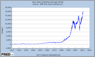
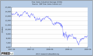
The Dow Jones Industrial Average is considered by some to be a vital sign of the health of the U.S. stock markets. Below are two tables showing the Dow Jones Industrial Average. Compare and contrast the two graphs. If a person only saw Graph 2, what might they assume about the Dow Jones Industrial Average? Explain.
Graph 1:

Graph 2:

Sample answer: the two graphs are similar because they show the Dow Jones Industrial Average (DJIA) over a period of time, they both use index as the unit on the Y-axis, and they both have the same title. The graphs are different because they have different origins on each axis, cover a different time period, and have different increments on each scale. Graph 2 primarily shows a decline in the Dow Jones Industrial Average. Given the limited number of years shown (2007 to 2009) one might assume that the DJIA only decreases over time.